01 / 21
spotify.
UX / UI Case Study · Mobile App

Spotify
Redesign

Everyone uses Spotify differently, so why does everyone get the same home screen? A redesign that puts users in charge of what they see.

Role
UX / UI Designer
Platform
iOS Mobile
Tools
Figma, After Effects
Personal Interest

I've used Spotify for years, but I don't listen to podcasts or audiobooks, so my home screen felt cluttered with recommendations I never touch.

A friend told me they listen to podcasts constantly, especially at the gym. Same app, completely different use.

People already know what they like. The app should bend to that.

How Might We

Help Spotify users filter and organize their home screen so they can quickly find the content they care about?

What Guided Every Decision

Designing the redesign.

01 · Yours, Not Theirs

Control over content

The home screen should be a record of how someone listens. Right now it is a record of what the algorithm wants to promote.

02 · Reversible by Design

Nothing is permanent

Hiding a section or switching modes should never feel risky to try.

03 · Familiar First

Change less than it feels like

New customization should sit inside patterns people already know from using Spotify for years.

04 · Test the Assumption

Icons aren't obvious

What feels intuitive to a designer isn't always intuitive to a tester, so nothing shipped unvalidated.

The Big Idea

A home screen that adapts to how you actually listen.

Toggle

Turn podcasts, audiobooks, or any section on or off entirely.

Reorder

Drag sections up so what matters most shows up first.

Light Mode

A visual option for the people who just don't want dark mode.

Try it · drag to reorder
Made For You
Podcasts
New Releases
Recently Played
Topic Research & Competitors
Sources
Personalized Experiences · Article

Spotify's own design team on why personalization matters, yet the current app still doesn't go far enough.

Don't Make Me Think · Book, Steve Krug

Good design means users understand it without effort.

Don Norman · UX Pioneer

His work explains why personalization and customization matter so much in an app like this.

Spicetify · Third-Party Tool

A command-line tool people already use to re-skin and customize their Spotify client, proof that the appetite for control goes further than what the app ships with.

Competitors
Direct Competitor

Apple Music

Same subscription model, tighter Apple ecosystem integration, better audio quality.

VS
Functional Competitor

YouTube Music

Personalized recommendations too, but bundles in video content alongside audio.

Audience Interviews & Usability Testing
Interviewed
Conner, Mike, Rachel
Kathy, Xally, Isabella

Fall 2024 – Feb/Mar

What testers preferred, across both interview rounds
Preferred the minus icon over other remove options
3 / 3
Found the drag / arrow interaction confusing
2 / 3
Had trouble locating the light mode toggle
2 / 3
Key Findings
  • Light mode is split down the middle, purely personal preference. Worth keeping, but the toggle button itself felt too big and a little obnoxious.
  • Being able to move things around was well liked, more customization is always welcome, but deleting a section should need a confirmation. It's too easy to lose one by accident.
  • Wants a way to fully remove a category they don't use, and to swap categories around within a section.
Personas

Click a name to see that persona.

David Maylees

David Maylees

22 · Data Analyst · Oakland/SF
Goal
  • Hide the features he's not using
  • Keep his commute simple and low-stress
Pain Point
  • Overwhelmed being forced to see everything at once
  • Switches between music and audiobooks, not both
Quote

"I need an app that shows me the content I actually use, and is simple, easy, and personalized for me."

Craig Simmers

Craig Simmers

42 · Product Manager · San Francisco
Goal
  • Use Spotify in light mode
  • A consistent experience across all his apps
Pain Point
  • Dark-mode default strains his aging eyes
  • Abrupt contrast vs. his other light-mode apps
Quote

"Why is this the one app that won't just match everything else I use?"

Audrey Smiths

Audrey Smiths

24 · Barista · Nashville
Goal
  • Feature only the music she actually enjoys
  • Recommendations that match her taste
Pain Point
  • Never listens to podcasts or audiobooks
  • Forced to see them on her home screen anyway
Quote

"That's all I use the app for, so why am I forced to look at the rest?"

Audrey, Barista · Nashville

"That's all I use the app for.
So why am I forced to
look at the rest?"

David's Story
01

David's home screen feels overwhelmed by features he never uses.

02

He opens customization to control what shows up.

03

Hides podcasts and audiobooks, switches to light mode.

04

Reorganizes so his most-used music appears first.

05

Confirms the layout feels like it's actually his.

06

Opens the app and starts listening in seconds, not minutes.

Moodboard

Measured the dark. Chose the light.

Spotify's dark palette already existed, so I sampled it rather than invent it. Light mode didn't exist on mobile, so those values are mine, held to the same rule the dark ones follow.

Sampled from Spotify
Base#111111 · 57.6%
True Black#000000
Secondary#B3B3B3
Yours#1DB954 · 0.9%
Chosen for light mode
Base#FFFFFF · 55.3%
Primary#000000
Secondary#707070
Yours#1DB954 · unchanged

57.6% dark, 55.3% light. One color holds over half of either screen. Both themes lean on a single dominant surface to the same degree.

Contrast ratios · checked against WCAG AA
21.0black on white
18.9white on #111111
9.0#B3B3B3 on #111111
4.95#707070 on white
7.30green on #111111
2.59green on white

The green doesn't survive the switch. It clears AA comfortably on near-black and fails it on white, so in light mode it can't be text or an icon. It has to become a filled shape with dark type on top (8.12:1). That constraint only shows up if you build both themes instead of inverting one.

Task Flow

Click a name to see that task flow.

Task: David is trying to minimize clutter. If he doesn't use a feature, he doesn't want to see it.

1

Opens home screen, sees too much unused content.

2

Taps the customize control on a section.

3

Hides the sections he never uses.

4

Drags his most-used section to the top.

Measurable outcome: did he build his layout successfully, faster and with less frustration than the default?

Task: Craig wants the app to finally match every other light-mode app on his phone.

1

Opens Settings, looking for a light mode toggle.

2

Finds it clearly labeled instead of guessing at an icon.

3

Switches the whole app to light mode in one tap.

4

Home screen now matches everything else he uses.

Why it matters: Craig wants the same screen every morning. Consistency is the feature.

Task: Audrey only uses Spotify for music, and wants the app to admit that.

1

Opens customization, sees every section listed.

2

Hides podcasts and audiobooks she's never opened.

3

Reorders so her own playlists appear first.

4

Opens the app to music she actually chose, nothing else.

Why it matters: Audrey finds plenty on her own. What tires her is everything else she gets handed.

The Final Design

A home screen that feels like yours.

Every control sits on the screen you are already looking at, and the panel only opens when you want to change what is on it.
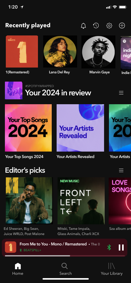
Final Spotify home screen with a hide control on each shelf and quick actions in the header 01 02 03 Closed
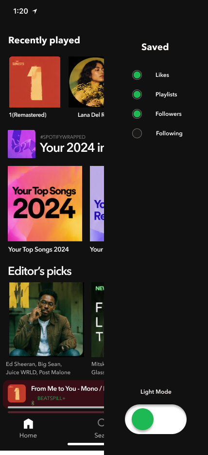
The same screen with the Saved panel open, switching which shelves appear, plus a light mode toggle 04 05 Open
  1. 01Hide a shelf from the shelf itself. One minus on the section header. No panel, no settings, no menu.
  2. 02Everything reachable from the header. Notifications, history, settings and add, all one tap from home.
  3. 03Three destinations, not five. Home, Search, Your Library. The tabs that existed to promote content are gone.
  4. 04Saved: bring anything back. Every shelf is listed here. Wrapped is switched off, so it is simply not on the page.
  5. 05Light mode as a preference. One switch, on the screen you are already looking at.
Testing & Results

3 testers (Kathy, Isabella, Xally), over FaceTime, completing tasks like turning off podcasts, dragging sections, and switching to light mode.

Kathy
  • Didn't realize the bottom button controlled light mode.
  • Preferred the minus button, faster with fewer steps.
  • Found drag/arrow icons confusing; suggested an Edit button.
Isabella
  • Clicked Settings first, expecting light mode to be there.
  • Also preferred the minus button over dragging.
  • Right arrow icon was unclear; wanted a clearer grab icon.
Xally
  • Struggled to find light mode again; wanted it labeled in Settings.
  • Preferred the hamburger menu for dragging, minus for removing.
  • Liked the animation, but some text was hard to read.
From Testing to Redesign
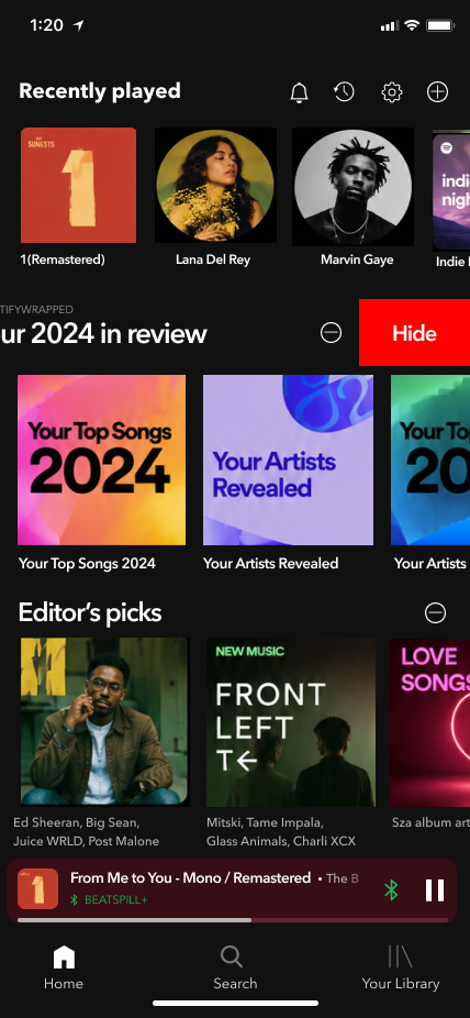
Final: the minus on the section header reveals Hide in place
Round 1: a separate Saved panel listing every section with large toggle buttons
Round 1 Final

Drag to swap the panel for the in-place control

Hiding a section used to mean leaving it.

Round 1 kept the controls in a panel. Testers reached for the section itself first, so the control moved to where they were already looking.

  1. 01Before: open the panel, find the row. Sections were switched off from a separate Saved list, so hiding something meant leaving the thing you wanted to hide.
  2. 02After: minus, then Hide. The control sits on the section. Press the minus, press Hide, and it is gone without the screen changing.
  3. 03Why it changed. Testers preferred the minus because it took fewer steps than the panel route.
  4. 04What stayed. The Saved list still exists for bringing a hidden section back, the one job it was genuinely good at.
Round 2
Final: a minus on each section header
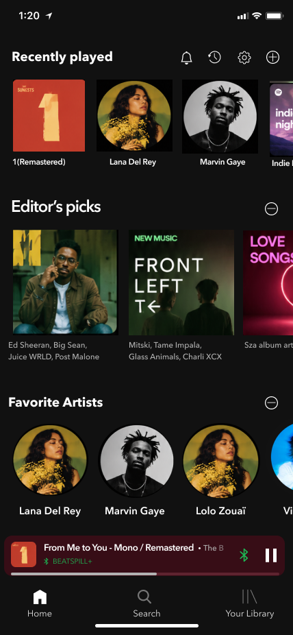
Round 2: a menu icon on each section header
Round 2 Final

Drag to swap the icon on the same screen

The icon was telling people the wrong thing.

Round 2 put a menu icon on every section header. Testers read it as something to grab and drag, not something that removes, so the icon changed to match what it actually does.

  1. 01Before: a menu icon doing two jobs. The same three lines were meant to open removal options, but the shape reads as a grab handle.
  2. 02After: a minus, because it removes. One icon, one meaning, no interpretation needed.
  3. 03Straight from testing. Testers said they preferred the menu icon for dragging and the minus for removing, which is exactly the split the final uses.
  4. 04The lesson. An icon is a promise about what happens next. This one was promising the wrong thing.
Dark & Light
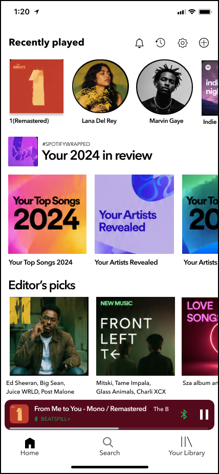
The home screen in dark mode
The same home screen in light mode
Light Dark

Drag to switch the theme

One layout, two moods.

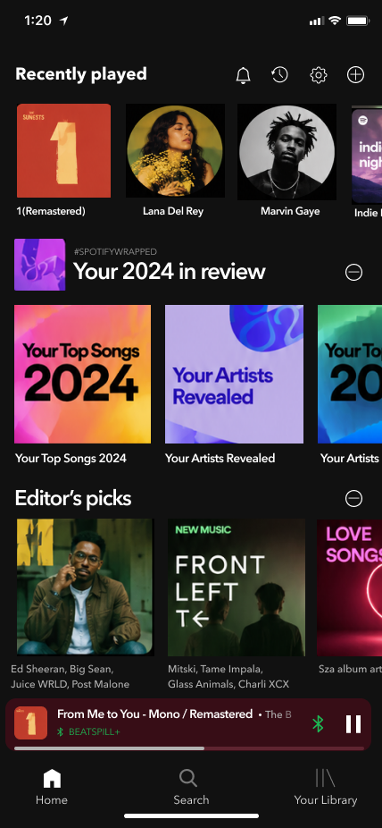
Light mode is a preference. Both themes run on the same structure, so nothing moves when you switch. Only the surface changes.

  1. 01Nothing moves. Same grid, same spacing, same order. Switching themes should feel like turning on a lamp.
  2. 02Contrast rebuilt, not inverted. Every grey was re-picked against a pale ground so text keeps the same weight it had on near-black.
  3. 03The album art is the constant. Covers carry the color in both themes, which is why the interface around them can stay this quiet.
Turning Feedback Into Decisions

Every change traces back to a tester.

Decision
Why
Hamburger icon for dragging
Testers read it as "grab" far more clearly than an arrow icon.
Minus icon reserved for removing
Testers preferred it over dragging, faster with fewer steps.
Light mode moved into Settings, labeled
All 3 testers expected it there, not behind an unlabeled icon.
The Companion Walkthrough

Every interaction, in motion.

Prototype

A fully customizable home screen: toggle off content you don't care about, drag-and-drop what matters to the top, switch between light and dark mode. A companion motion graphic walks through each interaction step by step.

Open full prototype in Figma →
Branding Guidelines

I didn't get to invent a brand. That was the interesting part.

Redesigning something this well known is a constraint exercise, not a blank page. Most of the system was handed to me and locked. My job was to decide what could be added without the result stopping feeling like Spotify.

Inherited and locked
  • The green. #1DB954, and the discipline of using it almost nowhere.
  • Near-black surfaces. #111111 is the ground the interface is built on, sampled from the app itself.
  • One typeface, three weights. Hierarchy by weight, never a second family.
  • Shelf-and-card geometry. Horizontal rows of square art. The thing everyone can already scan.
  • Player controls. Untouched. Muscle memory older than the redesign.
Added by me
  • Minus means remove. One icon, one meaning. Round 2 proved the menu icon was promising the wrong thing.
  • Controls live on the thing they control. You hide a shelf from the shelf itself.
  • Saved, not deleted. Every hidden section is listed and one tap from coming back.
  • Light mode as a peer. Its own surface, with greys measured against white on their own terms.
Rules I held myself to
Never invent a component Spotify doesn't have.If it needed a new pattern, the idea was wrong.
Green marks state, never surface.On, active, yours. It is not a decoration.
Nothing more than one tap deep.A customization buried in settings isn't customization.
No alert red.Hiding a shelf is reversible. Nothing here should look like a warning.
Conclusions
The Takeaway

Personalization isn't just better recommendations.
It's giving people control over what they don't want.

What I Learned

People really do want to customize their home screen and hide what they don't use, though not everyone who says they want a feature will end up using it.

What I'd Do Next
  • → Test with a larger sample
  • → Explore category-level customization
  • → Check whether people keep their custom layout over time
Conclusion

Thank you

The best playlist is still the one that feels like yours.

ALISA UTESHEVA
UX Designer